|
|
 |
 |
The classic Helvetica font was choosen for the product name for it’s simplicity and clear feeling that you get from
Pure Sound name. |
|
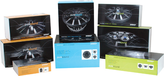 |
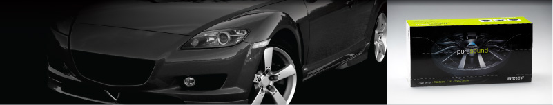
A very bold and visually striking package was created and clearly brands the product name. On shelf the clean and bold design stands out from the competition. The use of bright pure colours separated the line into the Convertible series, Coax series and the Woofer series. |
|
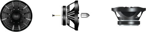 |
The products were modeled in 3D to their exact specs for greater control for how they are used on packaging and all marketing collateral. |
|
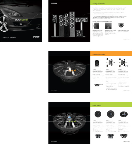 |
An overview brochure was created to offer history of the Energy brand and their extension into the car audio market. The brochure design was kept clean and simple so the consumer could make a knowlegable descision on purchasing the right system that matched their needs. |
|